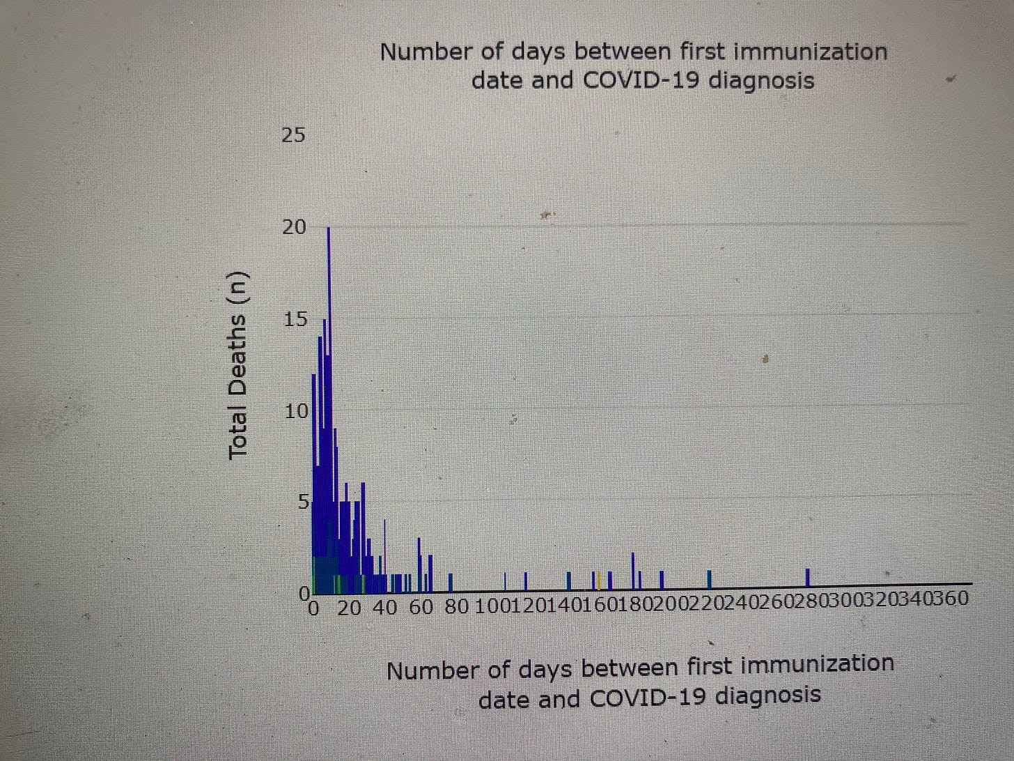
Two graphs worth your attention
Dear Substack subscribers,
I think some data graphs are worth spending some time absorbing their importance.
The first one plots CDC VAERS data for myocarditis (heart inflammation) versus year; so it is very easy to see the vast jump that can only be rationally explained by COVID vaccine use in 2021.
The second plat is from Alberta province in Canada and shows how deaths spiked in the first few days after vaccination when those victims would be officially classed as unvaccinated!


Is the analysis of graphene converting to chips of interest ?
https://forbiddenknowledgetv.net/la-quinta-columna-1-on-1-spanish-researcher-first-to-reveal-graphene-oxide/